Float
(Floaters:
1 )
Description:
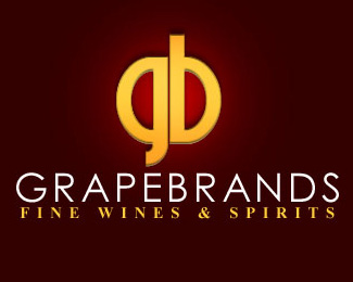
A wine and spirits company with a modern clean approach.
Status:
Nothing set
Viewed:
2147
Share:




Lets Discuss
I'd try making the two side identical in shape.
Replythe text on the bottom really bugs me...it doesnt really fit the %22clean/modern%22 feel you were going for...maybe something san-serif. Also, the mark doesn't appear to be centered over the type...is that intentional?
ReplyI was trying to align the bottom of the G with the E in grapebrands, and i was mixing the modern and the old in fonts to bring across the notion that the company imports fine older vintages as well as new ones.
ReplyPlease login/signup to make a comment, registration is easy