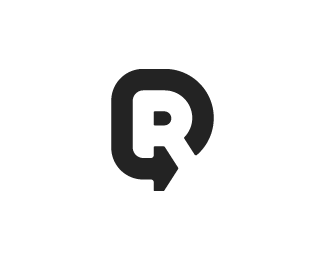
Description:
Wanted to give Re feeling Rethink, reinvent, etc
As seen on: Status:
Client work Viewed:
8741
Tags:
brandmark
•
logotype
•
logo
•
bold Share:
This is cool. Agree with Mike (logomotive), this design isn't close to the above two examples. It's fresh and telling a different story, well done Liutauras.
Conceptual wise, its actually closer than you think. Both marks are integrating the letter R, the idea of 'refresh' or 'reinvent' thus the revolving 'arrow'. The 'Refresher' even managed to include a speech bubble in! However, that said, both are executed very differently. Both can stand on its own merit and the logo world once again is at peace. For now.


Lets Discuss
it works, like the negative space, good work!
Replya good idea
ReplyInspired
Same idea, three years ago :)
Replyhttp://refresher.sk/9380-Refreshersk-ma-nove-logo
Mike, thanks for the link. I seen similar logotypes before such as: https://s-media-cache-ak0.pinimg.com/736x/2f/d3/7e/2fd37ecc9fdbbb472c8a75e46e1683b5.jpg , but this one is new to me. I think they are different enough to live in this world peacefully, what do you think?
ReplyNot even close In my Honest Opinion.
ReplyI see the Refresher logo as a Speech mark.
ReplyThis is cool. Agree with Mike (logomotive), this design isn't close to the above two examples. It's fresh and telling a different story, well done Liutauras.
ReplyConceptual wise, its actually closer than you think. Both marks are integrating the letter R, the idea of 'refresh' or 'reinvent' thus the revolving 'arrow'. The 'Refresher' even managed to include a speech bubble in! However, that said, both are executed very differently. Both can stand on its own merit and the logo world once again is at peace. For now.
ReplyMight be overkill, but have you thought of bringing the Leg of the R down with an arrow and underscoring the rest of the type? Probably too redundant.
ReplyGreat idea!
ReplyPlease login/signup to make a comment, registration is easy