Float
(Floaters:
12 )
Description:
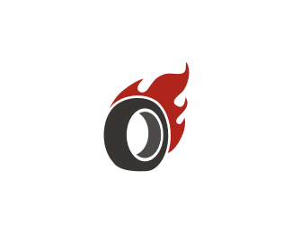
Just a simple and clean icon for a burning wheel.
Status:
Just for fun
Viewed:
11760
Share:


Lets Discuss
it looks a bit %22thin%22 as a wheel in my opinion. I like where is this heading, but almost want to see a bit something more on the wheel.
ReplyI like where it's heading too. Katharine is right though, the wheel is overall too thin. Not sure how well the perspective on the wheel and flames match though...seems a little off to me.
ReplyThe wheel's perspective seems abit off, but I like the mark.
ReplyWell, I think the thickness of the wheel is fine.. If it was a dragster tire, I'd agree that it'd have to be thicker, but for ricers a thin tire is often more favored. I think the lighter grey inside could appear a bit thicker though.. if that inside, middle point in the crescent was bumped more to the left I think you'd be golden. I like this!
ReplyThank you all for the comments!*Two things to say:*-It's true there's a little problem with perspective.*-The wheel looks thin because it's not a dragster tire.*Thanks
Replywow
ReplyPlease login/signup to make a comment, registration is easy