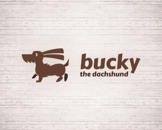
Description:
lovely simple, vintage and funny mascot logo for web, blogs, animal care etc...
As seen on:
Manudesign logoturn
Status:
Just for fun
Viewed:
4460
Tags:
friendly
•
family
•
pedigree
•
dachshund
Share:



Lets Discuss
Hey bucky, come here boy! :) Cute dog, but i would make the logo in one color, because it looks now like he's doing big fat poop ;) And I think that the background should be solid, it would make the logo more estethic. Althogh, I like it a lot :)
ReplyLOl, yeah Bucky don't need the other legs
Replymerge the leges togeather with the body :)
ReplyHey, that's my dog :)
Replypixel crook - yeah you right, thanks
Replylogomotive - I just try it, but I think with legs seems the doggy walk
secondseight - Initially I create it with the leg marge with the body, maybe I upload the variant
Yoon - ehehe so it's really funny dog!
I really like this design. When I saw it from a distance at a smaller scale the scruff/hair coming from his chin looked like aggressive teeth, so i was a little perplexed until I cam to this page for a closer look. Very well executed overall.
ReplyI agree with the comment about the hind leg. Also, maybe it's just me but, it doesn't look like a dachshund. Good design though!
ReplyI see the dachshund, but agree that hind leg is bothersome.
ReplyPlease login/signup to make a comment, registration is easy