Description:
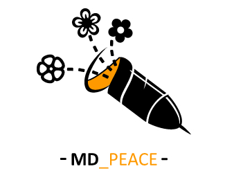
I have drawn this logo for two reasons: the first one is for underlining that MDlogo is against the war and wants the peace anywhere; the second is for creating a logo to stamp on the T-shirts of the MDlogo shoproom. This logo wants to represent a missile or bullet that during its run for the strength of the peace it opens giving birth to flowers and not death as it is usually make the war.
As seen on:
http://www.mdlogo.blogspot.com
Status:
Client work
Viewed:
2710
Share:




Lets Discuss
It's a little phallic at the moment. :-%7C
ReplyMmmm... Yes, it is for this reason that I have added a tip to the beginning of the missile... Unfortunately the form of the missile is that, I would not know whether to intervene otherwise.*Anyway, thanks for your feedback.
ReplyIllustration: kinda yes, typography: no. Darts have sharp edges, bombs usually don't. What's with the underscore and hyphens? Somehow is not right.
Reply@ fatalis: I have to confess you that I have not understood well your post... I'm so sorry, but my English is not so good!!! I think about having realized that you do not like the hyphens and the text... If you have desire, rewrite me another post explaining better what you intended... It would interest a lot me. *However I thank a lot you for your feedback.
ReplyPlease login/signup to make a comment, registration is easy