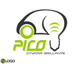
Description:
It's a logo for a project about vehicle design of Polytechnic of Turin.
As seen on:
http://www.mdlogo.blogspot.com
Status:
Client work
Viewed:
3318
Share:


Lets Discuss
The car/lightbulb hybrid mark is just really strange looking. I think you're trying to force it too much. I would take another look at trying to integrate the lightbulb while still keeping the shape of a car intact. The idea/concept is fine, just work on refining the execution more.**Also, work on refining your kerning in %22PICO%22 more (the space in between the letters).
ReplyThanks Sdijock for your comment... I would match the light bulb with the car in this way so the light bulb is more perceptible. Moreover the car profile is too rounded so I have unioned the 2 elements in this way because the layout it isn't so far from this. For the Kerning do you thinks the letters must be more distants?
ReplyRegardless of the shapes of both the car and the lightbulb I just don't think your mark is working - the two symbols just don't go together the way in which you've illustrated it. As I said, it feels VERY forced. I strongly suggest you re-think the mark.**As for the type, I would start by shortening the baseline of the %22C%22 as it currently looks more like an %22L%22. I would then VISUALLY kern the type so that the spaces between each letter are more visually even. Personally, I think there is not enough space between the %22P%22 and the %22I%22 and the %22C%22 and the %22O%22. But that's really for you to determine for youself. Finally, your font choice makes the tagline difficult to read. I would choose a different font. Hope these comments help.
ReplyOk I understand what you say... Now I try to re-think this logo... Anyway thanks for your comments, they are so important for me... I like to listen what the other people think about my logo... Thanks...
ReplyPlease login/signup to make a comment, registration is easy