Description:
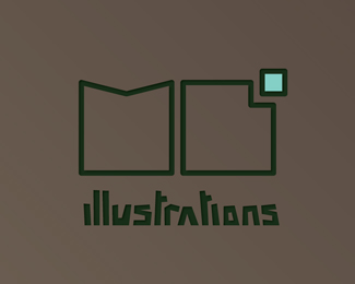
Some concept work for my personal logo. The M and B are my initials. The B is made from a square which has a smaller square substracted from it, forming the B. The concept behind this smaller square is ''think outside the box'' it has the color of a fresh blue sky, which reflects my personal feeling in the logo. I choose the logo to be the color green, i feel like this color reflects my personality and work. Illustrations is made in a type that is literally in the style of all my recent work. A rather abstract kind. A second remark, the little square substraction in the B could also be seen as the following letter in my name Bo. However This was not intended.
Status:
Student work
Viewed:
1563
Share:
Lets Discuss
Please login/signup to make a comment, registration is easy