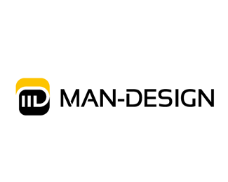
Description:
My own Logo / Redesign
As seen on:
Status:
Nothing set
Viewed:
1479
Share:



Lets Discuss
Nice mark. I almost see a closed fist. I also see the 'M' and 'D' letter. What's the meaning behind the mark? Or is it just meant to be abstract?
ReplyHi, OcularInk... Well its funny about the closed fist, I didnt meant it to be so, actually its just my personal Brand Redesign(You can see the %22old one%22 beside) (MAN) are my Initials, ans I do (DESIGN), but I wanted to be a 2d / 3d logo at the same time... Because I do grafik and Productdesign. I wanted it to be interesting but not complicated, simple but not boring, Im not sooo sure about Tipography, maybe I have to make there some small work still, what do you mean? **Thanks for your comments!**Greetings from Berlin
ReplyPlease login/signup to make a comment, registration is easy