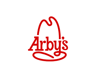
Description:
Custom lettering. This is a rough draft of the refresh direction that should have been.
Status:
Just for fun
Viewed:
3780
Tags:
•
hat
•
eat
•
fast
Share:


Lets Discuss
I like this more than their current logo.
ReplyThanks Tyce!
ReplyWendy\'s could have used help with their refresh as well. Good icon but the typo is horrible.
Replyhaha, yea for sure! Thanks logoboom!
Replyhaha looks like they are watching!
Replyhttp://www.underconsideration.com/brandnew/archives/new_logo_for_arbys.php#.Uqh2gBCmafs
Ha. If only these big companies would just get a logo designer for these projects and the non-designers in the company stay out of it, like the old days.
ReplyPlease login/signup to make a comment, registration is easy