The Grove Church
by LumaVine • Uploaded: Jul. 20 '11

Float
(Floaters:
12 )
Description:
Unused Concept.
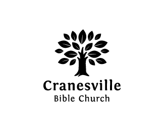
Logo Design for a church in Fayetteville, Arkansas. The brief called for a redesign of their old identity as there was new leadership who wanted to create momentum toward a new vision for the future. The target audience is a bit upscale in a community that values bike trails, farmers markets, and organic foods, but also is strongly tied to several large corporations whose headquarters are in town. The name The Grove Church was originally chosen to suggest a community who share the same source of water and support each other through deep, connected root systems. Their style is relational, casual, passionate, and Bible-based.
Another direction with custom type for this project.
As seen on:
Behance
Status:
Unused proposal
Viewed:
3893
Share:


Lets Discuss
Very nice. Why is the bottom horizontal line of the %22E%22 longer than the top? Bugs me a little%3B seems a tad out of balance. Regardless, this is lovely work.
ReplyLooking good. Just one thing, when looking at the thumbnail i thought the trunks of the trees were paint dripping from the green circles. Perhaps it was just me, just my 2 cents :)
ReplyThanks so much for your comments. Good eye on the shape of the E. I should tweak it a bit. Funny interpretation of paint dripping! I can see that a little bit. This is an unused concept, so I doubt it will get a lot more refinement at this point unfortunately. Thanks for checking it out and appreciating!
ReplyPlease login/signup to make a comment, registration is easy