Description:
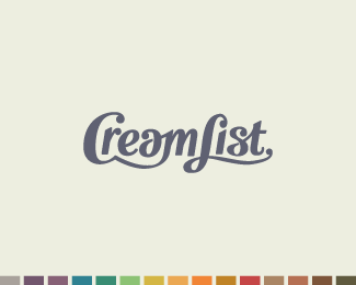
Wordmark for a website that recommends lists of products and services that are the cream-of-the-crop. Thanks for the great comments on the earlier version, click here for the updated version here.
As seen on:
Behance
Status:
Unused proposal
Viewed:
2668
Share:


Lets Discuss
Cool type, but I read %22CreamFIST%22 initially. Maybe that's just me though. What's going on with the colors at the bottom?
ReplyI read the same... %22CreamFIST%22.
ReplyThanks for the feedback! I wondered if a few people might read it that way. Very helpful to know. I will work on the top of the L some more. The colors at the bottom are just part of the overall branding scheme.
ReplyNice typo but at first glance i read %22CreamFist%22. Try to fix the L then this will be the winner.
ReplyThanks vernics!
ReplyI think it's just because you took away the L's counterspace.
ReplyYea you might be right designtofeel. Thanks for your insightful observations.
ReplyI agree but I like the forms you are creating in the face, nice start!
ReplyBut.... What is it?
Reply@Sean Heisler: Thanks so much! I am looking forward to taking this one farther. I hope to hear back from the client soon.%0D*%0D*@sbdesign: What do you mean? Did you read the description? I am afraid I don't know quite what you are asking. It is a logotype, not a depiction of something other than letters. Does that answer your question, or are you seeing something else?
ReplyExcuse, I am not able to read. But I know that the sign doesn't need the description...*Excuse for my English:)**http://www.youtube.com/watch?v%3Di7CzCAFYFAE%26feature%3Drelated
ReplyIt's ok, lost in translation, I guess. Your English is fine. %0D*%0D*Please don't advertise youtube clips here, though.
ReplyPlease login/signup to make a comment, registration is easy