Description:
Be drawn to your brand.
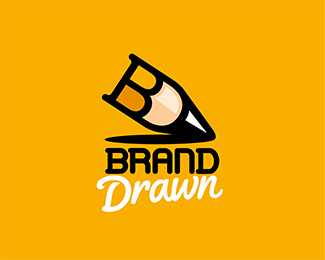
This is another concept for my studio's new facelift. The name reflects my passion for both identity and illustration, and is a slight play on words of the term "hand drawn".
See if you can find the initials?
Looking for any and all insight and comments on this one! PLEASE leave feedback, good or bad.
Status:
Work in progress
Viewed:
3583
Tags:
brand
•
design
•
draw
•
studio
Share:


Lets Discuss
Seeing as this is getting some floats, does anybody have any feedback in terms of the feeling of this overall? I usually don't actively ask for critiques, but I'm leaning toward this as my identity and would like any and all thoughts on the strength of the concept, how easy the initials are to spot, the color scheme, name, etc.
ReplyAnybody?
Good work as usual , I like the idea of the initials " B , D " creating the pencil , but i will suggest you to make it more simple , and change the font
ReplyThanks Sam! More specifically, which part of the text would you change? (type is all custom here) Both words? Appreciate the feedback. :)
ReplyThe name itself sounds really generic. I mean, I get it, but it could describe just about any designer. And the two D's at the end of the first word and the beginning of the second aren't fluid to pronounce either. What's wrong with "Lubera Design"?
ReplyI like the " Drawn " but it doesn't fit with the logo , and about Brand i dont like very much , maybe something more modern
ReplyHey Sam, thanks for the honest feedback. I will definitely agree that the d's aren't the most cohesive, but I think I might be able to do something creative with them in visual form so they mold or link together better... still putting thought into that.
ReplyTo answer your question, I have really put a ton of thought into this, so permit my ubergigantic response. My current line of thinking is this:
For a while now I've observed designers across all kinds of media, new and old, and have come to the conclusion that we all do the same thing. We create our own brand by taking our name and attaching a modifier to it (like 'design', 'creative' etc.) and then we create our logo in some kind of monogram style from our initials.
While there is a personal artistic touch to this, it is also SO commonly done that everyone kind of blends together. Every kid coming out of design school has a monogram representing their name and service. As a client, how would one sort through all of the 'John Smith Designs" without getting a little overwhelmed or turned off?
So, I wanted to create a more studio-esque image for myself. Something trustworthy, solid, that really looks like a service someone can rely on. To go into even more detail; I wanted to distance myself from any image of some guy sitting in his parents' basement designing logos. (Hahah.) I'm certainly not implying that many people think that, but there seems to be a certain cultural stigma happening that casts 'freelancers' as lazy people who pursued an arts degree because it was easy, and now they call themselves designers. Sadly I think spec work has devalued the craft and we get typecast now.
Long story short, I really would like to represent myself as a service, rather than an individual. To a degree, I want to be a bit more corporate, and then allow my work to speak for my abilities. And really, I went with a pretty generic name for that very reason. For one, I wanted something that defined my service straight away, right in the domain/name. It hits both of my focal points; identity and illustration, which I really want to focus on specifically. Also, I wanted to keep the domain short and simple, pretty straightforward. It's two words that everybody can spell, and that everybody should associate with design.
So I dunno, those are my thoughts. Trying to gain a slight edge in this field I guess! I'd be very interested in everyone's thoughts on this logic...
So c'mon guys, let's talk design business theory here! Hahah. Am I way off in my thoughts on direction?
ReplyReminds me of Batman! :)
ReplyMike... may I ask why? Hahah.
ReplyPlease login/signup to make a comment, registration is easy