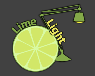
Lime Light
by Lottography • Uploaded: Feb. 18 '10

Description:
A logo I made for a graphic design group which fell apart shortly after.
Status:
Unused proposal
Viewed:
592
Share:

Lets Discuss
http://logopond.com/gallery/detail/77592
ReplyNot trying to offend, but I think that this logo is suffering both conceptually and from bad composition in general (I won't even get started on the black drop shadow). The lime is placed very awkwardly and seems to have no rhyme or reason for being there, other than playing off the name %22Lime Light%22. The same goes for the placement of your type.**Suggestion: If your lamp was to cast a green spot light on a surface and the lime slice is what appears within the spot then you would have an actual concept instead of a haphazard placement of images.
ReplyI think this is a great learning opportunity. Very nice to have two executions on the same concept. Please look at the link Joe provided. That link is a well thought out, well executed, well designed logo. It's simple and iconic.**Your execution here is a mash up of unrelated elements that literally represent the words. There's no concept. There's no design. There's no layout.**This is not to be harsh. Let's just take advantage of this case study that underscores what logo design is.
ReplyYou guys are critiquing poets. Great advice.
ReplyWould you guys say I potential?
Reply%5E%5E In all honesty, it's too early to tell. Let's see an update, and we'll let you know. :-)
ReplyI do not think there is a point in doing an update when someone made a logo with the same name and is x9001 better.
ReplySure there's a point. If you can do it better then we'll say you have potential. %3B-) Go ahead, make it x9002 better. At least try.
Replywhat a description! lmao
Reply%5EI literally laughed out loud when I read it Srdjan. Haha!
ReplySure it's for the same name...but when working on a logo you will present multiple viable designs / solutions for the same name on each and every project. Back in my agency days when we were charging up to %2410k for identity design, we might present 50 designs for the same name. That's when you learn how to push past that wall and dig deep. Or just as likely bang your head against the wall :)
ReplyPlease login/signup to make a comment, registration is easy