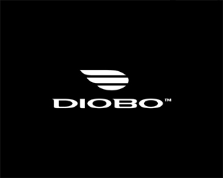
Description:
This logo designed for a an athletic shoe company hopefully competing with the some of the big dogs. This work is one of my most proudest concepts.The "D" represents the sections of a racetrack . The mark also has the shape of a human head with the hair flowing. The mark is strong and memorable. Hope you all see what I see as well.Custom type.
Status:
Nothing set
Viewed:
11439
Share:



Lets Discuss
Thanks Jon, BTW I Love your work so much.
ReplyBold. Strong. Progressive and memorable!
ReplyI see what you see... and I like it. %3B-) This is really nice!
ReplyBeen waiting for this one to get one here for months now buddy! Love it!
ReplyI can see how nice this would look on the side of a shoe. Very nice !!
ReplyVery cool Logomotive as always! :D
ReplyNice one, Mike. Always great to see something new from you.
ReplyVery strong mark Logomotive.I want that shoe:)
ReplyThe big dogs should be very worried.
ReplyGreat work
ReplyThanks everyone, really glad to see you all like it as much as I and my clients did. Always nice to have the right logo chosen.
Replynot only does this compete with the big dogs... it belongs with them!
Replyawesome. the mark has some nice movement.
Replyjust good )
ReplyI actually didn't see a head or a race track in this but a wing instead which is equally important. I love the way the small serifs are styles to compliment the symbol. Just beautiful. Very strong!
ReplyOkay, I'll be the grinch here, I think its nice but stylistically I see this close to Adidas. The type also seems just a little too low or its too close to the symbol. Anyway I understand your description well and it still is high quality work as always holmes. I'm curious if there's a coloured version?
ReplyThanks Julian, there's always going to be controversy over the more simplistic designs, especially in the same industry. The lines convey a different purpose, are horizontal,have rounded shape and form 3 meanings or more depending on how you see it. Everyone has an opinion. I back my work 100%25 an was not inspired whatsoever by any other works. I did my background studies. Now the PTO will make that decision. Hopefully I'll open a new pair of sneakers with this mark on it Christmas day and you can be the grinch who did NOT steal Christmas, LOL!!
ReplyBe the Grinch who did NOT steal Christmas, LOL!! it cut me off.
ReplyI appreciate your response Mike.
ReplyI see the adidas parallel but it's unique still IMO. Very nice feel.
ReplyNice work. I wish you all the best to have your creation on your Christmas present :%5E)
Replythanks glen and dache.
ReplyI dig it! and wish u good luck. nice job!
Replyi'd say this is close to the best I've seen of your work.*the simplest are always the hardest.** fav
ReplyBrilliant idea and execution!
ReplyCheers and thanks!!!
ReplyMost exsellent (sic)...VSOP
Replystrong, I love it ... the mark can be also a shape of a wing %22the winged sandal of mercury%22
ReplyThanks topfuel and gpxl.
ReplyI could see this one on shoes! Great job!
ReplyThis is so well executed mike. So simple but so much character. Did the company ever take off?
ReplyThanks James.*Dennis, I wish, one of those ten year projects I guess. Client wanted me to do like 10 Pantone combos for shoes etc. I have not heard from since.
ReplyHmm, what a shame. Would have been nice to slip in to a pair of those wouldn't it :)
ReplyThis project really disappointed me, I was excited to get a new pair of sneakers.
ReplyPlease login/signup to make a comment, registration is easy