Altura de Vuelo
by Logomotive • Uploaded: Dec. 11 '07 - Gallerized: Apr. '12

Float
(Floaters:
85 )
Description:
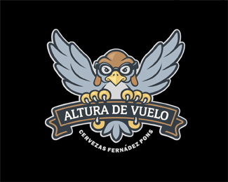
Logo created for a Beer brewed in Spain. "Altura de Vuelo" means "Height of Flight". Client wanted something that flies and a logo that is special and has an American sports like feel. I tried giving the logo an A/V shape and the overall shape creates an arrow to help convey the height aspect.
Status:
Nothing set
Viewed:
23940
Share:

Lets Discuss
Well logo did not fly (no pun intended ) with client (too serious for them), bummer. Back to the drawing/concept board.
ReplyI was just looking around and something just hit me. I notice that hardly EVER or NEVER a logo get voted down, UNLESS it's on the FRONT PAGE%3E WOW! It's like no one gives a rats ass if it's not in the gallery huh??? but if it, OH is I must vote it down or vote on it.... This is ALL a big joke. WHO really cares. I was just looking THIS particular logo has all POSITIVE votes until,.. now,.. you watch. that I have posted this. WHO GIVES a RATS ASS! GO AHEAD VOTE THIS ONE DOWN TOO! People for the record%3E I feel the voting system stinks, BUT just because you do not like another logo do you really think you need to vote it down? I mean I don't see you (in general) voting down those logos that are NOT in the gallery??? Like we REALLY care. well I for one don't , and it makes me sick. This is WHY I removed all my stuff and re submitted. Critique, and vote,.. if you must designs based on form and function and if it WORKS for the target audience and not for yourself...ASK yourself%3E%3E%3E %22Is it a good logo/well designed?%22, NOT do I like it?%22 There IS a Difference!!!
ReplyYeah and Mr David Maloney Second toughest,.. The first to do so So I just proved my point ha ha ha ha ha .*
ReplyProblem is, Mike, that non-designers don't necessarily think like designers. While you and I might judge a logo for it's typography, concept, layout, execution, etc., the average person looking on logopond will, most likely, only judge it based on their personal interests/tastes. Because design is so subjective, it's going to be tough to get a unanimous vote on any of your logos.**This one gets a five star in every regard. The colors are fantastic, the concept is excellent, and the execution is perfect (as is with all of your logos). To anyone reading this, just because a logo doesn't meet your style expectations doesn't mean it's not a successful logo. Like Mike mentioned, take in consideration the form and function, concept, and whether or not it works for the target audience and the subject matter being depicted. There is far more to logo design than just style.**Cheers!!
ReplyI happen to think this is a great logo, but OcularInk is right, good logo design is more than visual style. Presentation also comes into play. Your Dec. 26th comment was hostile and unprofessional. If I were a client and you came at me like that, I'd %22vote your logo down%22 and I would ask you to leave my office as well. *
ReplyBoy, glad that's all over. :)
Replyfunny thing is i don't remember floating this one but i'm sure glad i did.
ReplyLOL Thanks!! but was not about floating but the old stupid system of knocking people down by defloating. I was trying to make a point of how dumb and pointless and discriminating the old system was.Glad that system is gone now.
Replydamn, where's that sink button when you need it... wait.. no, i pressed wrong one, sigh... :)
ReplyI don't see how anyone would vote this down. I'm glad I wasn't around in those days, I have a feeling all of my stuff would have been in the negative.
ReplyI think there are still few with -something attached :)
ReplyLOL guys, some remember it was quite horrible. I felt bad for many getting logos sunk, some just out of spite.
ReplyYeah that IMO needs to be readjusted, especially the -0s ones. Not right.
ReplyBTW, Little typo I never changed. this should read Cerveza not Birra, that's Italian. :)
ReplyOldie but goodie!
ReplyThanks Anthony. To be honest it was hard with the language barrier, I provided at least four designs and thought each time based on clients brief I was on the money. My time is valuable these days and had to move on.I designed intended for label design on all the work.**@logoboom,..Yes you are Glen.
ReplyBTW, here were some of the other designs.*http://logopond.com/gallery/detail/22284*http://logopond.com/gallery/detail/22290*http://logopond.com/gallery/detail/21997
ReplyI believe this logo executed it the best, it has the traditional label look, and it can easily be associated with alcohol. I love the design on the other ones too.**secondthoughest I dont even think you have an office to kick him out of...**
ReplyThanks a lot Antonio. Yeah I though it was on the Money based by the brief they gave me. They wanted an American sports like feel and convey %22Height of Flight%22 The design they ended up using while it works ok, does not convey what they requested.
ReplyGreat work Mike! I know Armenian brandy logo with a similar idea: http://www.dropmocks.com/iY1fg*
ReplyMike, FWIW, I really like your more cartoony version, but IMO, this one really is far superior for a beer label. Seems like you had such a headache with this job...
ReplyThanks Nikita.:)*Jon, Yes a huge language barrier issue. Guess I should have hired a good translator. I was surprised of the final choice for branding. Nothing what my initial brief read.
ReplyI might add, I think that is largely due to clients changing their mind during the process. Kinda morphing thoughts along the way, while we push buttons.
ReplyQuality
Replygreat staff!!!!
Replyoh my God
ReplyIt's just some kind of celebration! So much luxury logos.
ReplyBrilliant stuff. And I just saw this was uploaded in 07?
ReplyThanks you all for the comments.
ReplyPlease login/signup to make a comment, registration is easy