
Description:
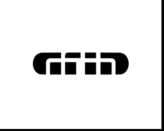
Can you even read this? I thought it could also read as Gria plus not sure if the Grid is apparent. Just thought I'd throw it out here.
Status:
Work in progress
Viewed:
2983
Share:


Lets Discuss
I read Grin.
ReplyI figured it was too hard to read and could be read too many different ways. Thanks!
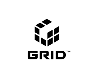
ReplyHow does the Variation read now?
ReplyI read both of them GRID, although yes, the black one is more legible.
ReplyBtw. I dig the concept.
variation is more readable, r top could be a tad wider imho :)
ReplyOne of the more unique logotypes I've seen in awhile. Nice, Mike!
ReplyPlease login/signup to make a comment, registration is easy