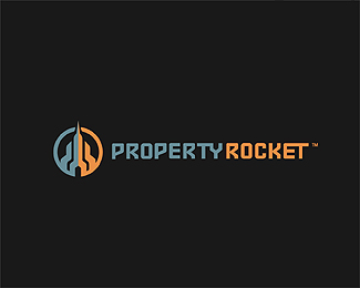
property rocket final
by Logomotive • Uploaded: May. 12 '11

Float
(Floaters:
24 )
Description:
Final logo for property rocket. Client wanted all lowercase, so I adjusted and adapted from previous design. They wanted a more friendly approachable feel. I preferred the Uppercase but understand their concerns and they know their business better than I do.
As seen on:
www.propertyrocket.com
Status:
Client work
Viewed:
3440
Share:


Lets Discuss
I think this turned out nice!
ReplyThanks a Bunch Floris.
Replywow, nice.
ReplyThanks tickey.
ReplyBy the way, if you sharpen the image in ps, you might want to fade the sharpen filter to 50%25, makes it look more natural imo
ReplyThanks for the tip Floris.
Replyvery nice mate :)
ReplyThanks cpuentes23, Final can be seen here. http://www.propertyrocket.com/
ReplyMust've missed this one Mike, very nice
ReplyThanks Mr. Hardy.
ReplyThat's pretty badass! Great work.
ReplyThanks atomicvibe. I found it fitting.
ReplyLooks way better on white background, although, I do like the uppercase letters. Good Job here.
ReplyThanks 87laylow, I also I preferred the uppercase myself.
ReplyPlease login/signup to make a comment, registration is easy