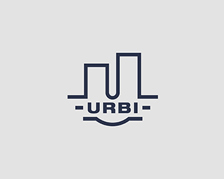
URBI
by Logoflow • Uploaded: Jul. 29 '14

Float
(Floaters:
13 )
Description:
Urban planning office. Do you see skyscrapers? :)
Status:
Client work
Viewed:
5470
Tags:
monogram
•
U
•
building
•
urban planning
Share:


Lets Discuss
U N I L E V E R ? ? ? ?
ReplyI don't think so, but if you saw similarity that gives me a clue that maybe i should correct that a little.
ReplyGood job! I dont think this is similar to unilever logo. The only think i dont like is that the white line almost cuts the logo in half. Sorry for my English. Isnt my native language. Hope you understand what i mean! :)
ReplyI perfectly know what you mean :) Thanks for comment and advice, i try to use it :)
ReplyUpdated, how about now?
ReplyI think this is very strong. I like it.
ReplyLooks to Close to Union Bank Logo IMO
Replyhttps://www.unionbank.com/
ReplyThank you for comments.
Reply@logomotive seems similar but not to close, i think. Besides it's differnt area of interest. Although thank you for pointing me that out :)
NP just giving you a heads up. Best wishes.
ReplyThanks a lot. I appreciate it.
ReplyYeah I had to look up Union Bank logo just to see what you meant Mike and I can see where you would draw the similarities, however, I think that that's about all they are though; similar, which, in my opinion isn't a bad thing... just... similar.
ReplyWell, i slept with this what Mike said and i have to admit that there is something in what Mike said. Good logo has to be unique and not to be associate with any others. Mine is at least one and a half :). For now i leave it like it is, because my client (my wife ;) )likes it, but there will be some rebrand of this logo to be uniqe :)
ReplyHey !!! there is a LOTTT of everything!! especially logos...i looked for the bank's logo...and to be honest there is similarity in the shape but I wouldnt link them together...I LOVED the urbi logo much more !!! nicely done :) and the skyscrapers are nicely integrated !!! Thumbs up
ReplyThanks for your appreciation, i made a lighter version of the logo, maybe you'll like it a little bit more ;) and maybe i just have to come full circle to say that's the one :)
ReplyPlease login/signup to make a comment, registration is easy