Description:
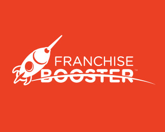
minor tweets to rocket- let me know what you think guys
As seen on:
spryagency.com
Status:
Client work
Viewed:
3110
Share:





Lets Discuss
Wondering: why is the horizon essentially cutting right through the word 'booster'...? Or, is that not the horizon??
Replyi was thinking it would be the moon surface, wanted to add craters to show that but client wasnt going for it.
ReplyThe rocket is very nice. Perhaps putting the horizon below the word 'booster'...and have the letters curving to synch with the curve of the surface...what do you think of that?**And, I say, play around with the rocket some more. Try putting some exhaust clouds coming from the bottom of the rocket%3B see what it looks like at different angles. This has a lot going for it.
ReplyThanks JF- if i get a chance to add some additions to the logo- I will definitely try these out.
ReplyI agree with GF, the rocket is very nice but like now i think there might be too much different elements in the scene.
Replythanks guys- ill see if they let me make this changes since client already approved logo. :)
ReplyPlease login/signup to make a comment, registration is easy