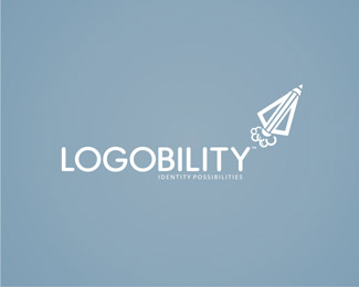
Description:
So I am hoping I can get some comments woth this one, this is what I came up with for my new identity. I wanted something clean and simple as well as a more conceptual mark, but I wanted to have a fun element to the mark also, the mark being a pencil rocket, there are a few thoughts behind the mark - pointing skywards, forward direction, new possibilities etc etc. Will appreciate your comments everyone.
Status:
Just for fun
Viewed:
3092
Share:


Lets Discuss
I can see the pencil/rocket combo, but i also saw an arrow tip first. also i think the puffs of smoke needs adjusting, seems to small or too close to the rocket. and your tagline is way too small, i can barely read it at this size.
Replyi agree with everything gyui had to say, also...**question: why are do many graphic designers use a pencil in their logos?*i personally always sketch with a pencil first before even touching a mouse, (i wonder what percentage of people sketch first nowadays?) if graphic designers are your audience then im sure they would understand the pencil, but as for clients im not sure... just my opinion, but i don't see people on the outside (meaning clients and such) relating a pencil to graphic design. Clients nowadays think that you click a button on the keyboard and wallah you have a logo. I suppose if you are known for your hand done work, that would be acceptable.**not trying to give you a hard time, im just wondering if there is something im missing something... i actually like the visual look of the mark, just wondering about the significance of it?
ReplyI like the logo a lot, but as gyui said ur tagline is almost impossible to read and about the smoke, that should come after the fire that launches the rocket, meaning smoke further away from the rocket and maybe you could shape the inside of the smoke to make like like a fire is untherneed the rocket launching it
ReplyPlease login/signup to make a comment, registration is easy