Float
(Floaters:
44 )
Description:
wedding accessories. calligraphy
Status:
Client work
Viewed:
5522
Share:
Lets Discuss
B E A U T Y T O O !
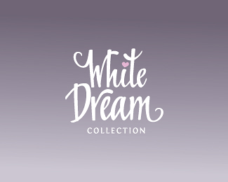
ReplyIt says %22White Dream%22 but there isn't any white to be found!
ReplyLo. cool, how ever)
Replyvery nice, i feel that just one heart is enough (by one i mean the one on the i)
ReplyBeautiful Typography!
ReplyGraphically pleasing logo!
ReplyNice calligraphy!*I like the background too, it reminds me on pillow and I start to feel sleepy %3B)**About the hearts: I think that @dotflo is right. Theese two big hearts make the one on %22i%22 invisible, plus the one that is upside down looks wierd to me, like it represents sad love.*If you leave just the one on %22i%22 and make it baby pink, whole logo would look cleaner, simplier and the little pink heart will shine in the middle. Just my opinion.*
ReplyI really love the type, but IMO, the pink hearts are overkill - especially the one that's upside-down.**I think this logo would be much more elegant, classy, and successful if you removed both of the pink hearts from where they currently are, leaving just the one above the I.**Or, perhaps you could try to find a way of replacing the heart over the I with one of the pink hearts.**But I seriously think that the typography here is what makes this logo special.
ReplyThank you all for your feedback! I agree with the opinion that the heart can be removed.
Replyi think that the dot above the %22i%22 can be pink or white, doing this you can remove the other two hearts.
Replyremoved hearts
Replyi feel that it looks more clean now, but that texture bg was more appropriate than the gradient :)
ReplyPlease login/signup to make a comment, registration is easy