Description:
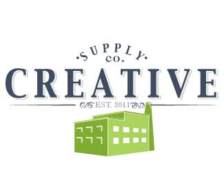
This is a revision of the previous version. I just uploaded over the old one. It is a concept for a marketing and design company.
In this revision I played with the balance of icon and type a little and changed the font in the word "supply" to be the same as CREATIVE
Status:
Work in progress
Viewed:
1033
Share:
Lets Discuss
A few things: the factory image is a little strange in this context, doesn't quite fit conceptually IMO. And visually, it's totally getting in the way. Secondly, it reads backwards. I read %22supply company creative%22. To fix this, you could move %22supply co%22 below %22creative%22 and reverse the arc of the work so it curves downward. %22Est. 2011%22 would also need to be moved above creative. Thirdly, you're using four different typefaces here when you could easily be using only two. It would clean it up a bit. I'd probably stick with the fonts for %22creative%22 and %22supply%22. That being said, the type is quite nice.
ReplyThanks for the thoughtful critique. I agree that the three typefaces might be a little much. I played a LOT but the issue is that the %22co.%22 in the typeface that I used in %22creative%22 does not look right as it's too - not right. It's hard to explain. **Contextually the factory works on many levels. Our business is located in a factory that looks like that. I agree that right now its a little heavy, I think it needs to be smaller or reworked again. Also, the logo itself is inspired by old/antique logistics company logos. The look is of a logo that might have been on a distribution slip or the side of a cardboard box from a manufacturing plant. My family worked in the %22logistics%22 industry for a long time so I did have a good number of reference materials. It was common to %22incorporated%22 or %22supply co%22 above the actual name of the company. Maybe I need to work a little harder on playing up the %22creative%22 so that you don't see %22supply co%22 first?? **Thanks again for the critique.. Going to rework and see what I come up with. *
Replyhey @designtofeel would love to get a revisit from you on this. Made some small changes to the type.
ReplyPlease login/signup to make a comment, registration is easy