Description:
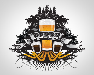
The was a logo created for a local martini bar
As seen on:
Two Ceres Street
Status:
Client work
Viewed:
1608
Share:


Lets Discuss
quite nice.*maybe try flattening the top of the T off..?
ReplyLooks somewhat too formal for a martini bar, but great nonetheless.
ReplyPlease login/signup to make a comment, registration is easy