Float
(Floaters:
2 )
Description:
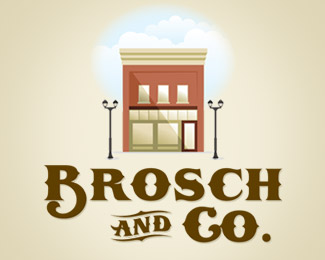
Design for a company that houses other businesses at their location.
Status:
Nothing set
Viewed:
1505
Share:






Lets Discuss
Lovin' the vintage style. Only thing that doesn't sit right with me (and this is more personal preference) is the size of the illustration - I think it could go a bit larger.
ReplyI agree with kweeky regarding the sizing proportions. The text can be shrunk down by about 25-35%25 allowing the mark to be larger. Especially considering the size of the lamps on the lampposts. Those could get lost at smaller sizes. I also don't think you need the cloud background, but that's just me. :-)
ReplyI think you could tighten the kering in %22BROSCH%22 a little and open up %22Co%22 slightly. And personally, I would bring the bottom loop of the %22B%22 down a little more and shift the %22AND%22 and %22Co%22 over to the left more (almost centered underneath the building).
ReplyPlease login/signup to make a comment, registration is easy