
Description:
Unused proposal
Status:
Unused proposal
Viewed:
3663
Tags:
fight
•
matador
•
bull
Share:


Lets Discuss
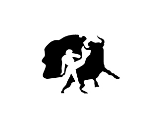
Cool idea. I like the positive/negative relationship, I think it could be made better though. I would try to get rid of the connection between the bull's horn and the matador's flag (?). Also, the negative space between the flag and the bull's back is running into the matador's form so it looks like there's something to see there.
ReplyI think it is lovely.
ReplyAnd you mean cape. The matador's cape.
ReplyThanks guys...
ReplyActually I was trying to portray the matador's legs... Him being in front of the bull. The triangular shape below the matador's body would be the space between his legs.
The space between the bull at the cape is still there though, does it strongly lead the eye into thinking there's something there?
I will see what I can do with the horn flag.
Thanks for the feedback, I really appreciate it.
Please login/signup to make a comment, registration is easy