MSK3
by LadyGrey • Uploaded: Apr. 23 '11

Float
(Floaters:
55 )
Description:
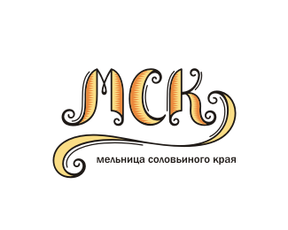
Mill of Nightingale's Land
flour manufacture. Reload brown version of logotype. Dennis, thank you for better's comment
Status:
Unused proposal
Viewed:
4827
Share:


Lets Discuss
Nice style Alena. Like the simple lines and the green orange combo. I'm not sure about the black - maybe dark brown? I think the bird needs a bit more work but I really like where this is going. Nice job.
ReplyThank you, Dennis!*You are right in all)*Brown is not client's wish
Replywonderful design Alena
ReplyThank you, Bernd.*Very pleasant to hear this from you!
ReplyReally dig this logo. Love the style for it.
ReplyThanx, Nathan! I appreciated)
ReplySweet
ReplyVery nice. I'd like to see it without the decorative outside border, as this is the heaviest element of the mark. I think it would still hold together well.
ReplyWhy I didnt see this before? Beautiful style Alena
ReplyThank you, mates!*You words are very kind, I appreciated them)
ReplyReally nice style here, LadyGrey.
ReplyThank you, Nick!*Your comment so pleasant for me)
Replyshikarnoe logo)*odno iz lu4shih u teb9%3D)
Replyto Oleg: if this is best logo, then I must quickly doing other new logos)
ReplyVery Nice :)
ReplyThank you, Ricardo!
ReplyLove it!
ReplyThank you, Nebojsa!
ReplyLovely line work!
Replydelicate and mood, really nice :)
ReplyThank you, Piotr & Acmark)
ReplyPlease login/signup to make a comment, registration is easy