by LPAdmin • Uploaded: Aug. 15 '12 - Gallerized: Aug. '12
Description:
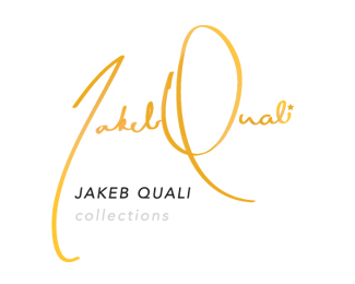
Client needed to revamp their logo for a more upscale unique look that would carry them into the future and remain timeless. The client wanted to see a classic signature with just a touch that embodied his 'swag'. He came across to me through our conversations with his partner as a star and so I incorporated that into the design.
Illustrator's paintbrush was used freehand (an awesome tool) with a mouse... yes a mouse. Gradient mesh gives subtle color shifts throughout the gold piece.
As seen on:
Jakeb Quali
Status:
Client work
Viewed:
7492
Tags:
yellow
•
gold
•
script
•
clothes
Share:
Lets Discuss
Wow, very nice! loved the flow, the color, nicely done!
Replythanks :D
Replyreally expressive signature ... like!
ReplyReally nice. Just curious as to why the name is repeated beneath it?
ReplyThey wanted to make sure you could read it. I believe they also want to use the signature on its own. The actual legibility of the mark in this case is actually an accidental happy point, it really didn't matter if you could read the words or not. Almost as a 'just in case you aren't sure of the name, here it is'
ReplyI think it actually helps reinforce the legibility of the script type, because arguably 'jakeb' might be a hard read without it right underneath.
I like this style of letters. This remember me Ogilvy's logo
Replyvery nice signature, if they really want the name duplicated there just wondering how would it look in smaller size in comparison to the signature
ReplyI like these works, where letters are not imitations, but there is a live calligraphy energy
Replyi love this fluent type
ReplyDefinitely feels upscale! You nailed it.
ReplyDamn ! Sexy as fu*k
ReplyYea man this is really pretty. *THUMBS UP*
ReplyPlease login/signup to make a comment, registration is easy