Description:
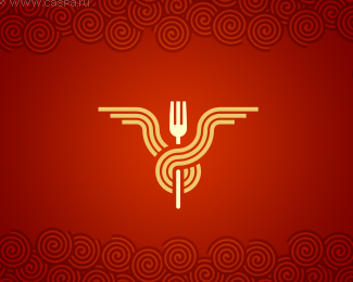
Fastfood network. This label combines humour, artistic performance and creative view of the product. Keeping their plasticity and kind of gracefulness noodles at the same time becomes static symbol having been tightly tied up around the client's fork. Looking like winner's trident, the logo sonorously and brightly assert its position.
Status:
Nothing set
Viewed:
10170
Share:

Lets Discuss
nice. even better without the swirls on the edges
ReplyLove it!!!! Great job logoped :D
Replyvery cool.
ReplyVery clean and simple. Great job.
ReplyGREAT JOB unique,memorable and executed very good. YUMM !
ReplyNice curves. Very well drawn and unique.
ReplyVery effective!
ReplyNice one, dude!!
ReplyI wonder how it would look with the name incorporated.
ReplyNow that is what I am talking about! Nice work!
ReplyNice Work... i love it...
ReplyGotta hand it to you this is great and really fresh looking. Top notch.
ReplyJumped right out of the thumbnails! Great stuff PED!
ReplyAwesome!
ReplyI 2nd what chanpion said, definitely jumps off the page! Great mark!
ReplyExcellent logo! Really love it!
ReplyThis is fantastic! A favourite for sure!
ReplyGreat mark. Love the symmetry.
Replyfcukin sweet.
Replylol %22lapsha%22 this is great! %5E%5E
Replyvery nice, well balanced, well executed en simple and straight forward. A good one. But I would like to see the name incorporated too ...
Replyas usualy - COOL!
ReplyReally nice! Added to faves :)
ReplyThis is logo gold, really unique memorable mark.
Reply%5EAgreed. I think Logoped is one of the best designers on LP.
Reply@Climax: Why do you always insist on having type with the mark?
ReplyExcellent! :)
Replyawesome design, I would prefer it without the swirls around the edges, though.
ReplyPlease login/signup to make a comment, registration is easy