
Description:
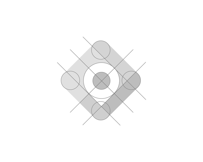
Let's talk about the new Google Maps icon. A few years ago we worked on a project related to navigation, this was one of the proposals and it's funny how “googly” it looks today with google colors.
As seen on:
Branding studio
Status:
Just for fun
Viewed:
4062
Tags:
graphic design
•
design studio
•
identity studio
•
brand and identity studio
Share:


Lets Discuss
This Google Maps logo is clean, modern, and instantly recognizable. The simplified map pin icon with bright, contrasting colors effectively conveys navigation and location services. It’s minimalistic yet distinctive, maintaining Google’s recognizable color scheme. A strong, clear design for a widely-used tool!
Replysimple but extremely affective
ReplyPlease login/signup to make a comment, registration is easy