DeepSeek logo redesign
by Kreatank • Uploaded: Jan. 28 '25
Description:
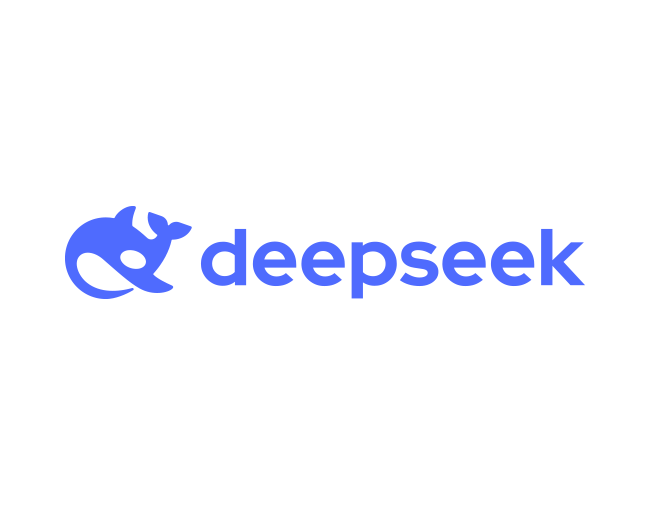
After seeing the trending DeepSeek AI logo, I felt the need to redesign it due to several issues. The overall shape feels off, I can't tell if it's supposed to be an orca or a humpback whale. The eye is too small and pointless, the wordmark is outdated and doesn't complement the orca’s rounded shape. It feels like the logo was AI-generated, so here is how a human logo designer would do it.
In my redesign, I fixed these issues by creating a clear and recognizable orca logo with clean lines, making the logomark simple and scalable. I also chose a modern, cohesive wordmark that complements the orca logomark.
What do you think?
As seen on:
DeepSeek logo redesign
Status:
Work in progress
Viewed:
1,108
Tags:
•
creative
•
circle
•
simple
Share:


Lets Discuss
Please login/signup to make a comment, registration is easy