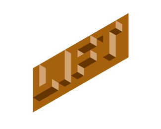
Float
(Floaters:
38 )
Description:
logo for Coffee and Smoothie bar
Status:
Unused proposal
Viewed:
6842
Share:

Lets Discuss
Nicely done!
ReplyI thought this was the strongest, but...
ReplyIt certainly breaks the mould in a world of swirls and cups.
Replytoo strong and blocky for 'coffee' or 'smoothie'.I like the other ones better.
ReplyClever and very nice logo...
Replyreally nice mark
ReplyVery nice feel here Brian!
Replythanks Bojan. I really liked this direction, but the client went with another direction. File this under %22use again someday%22.
ReplyA classic!
Replygreat concept. nice twist to the norm of a coffee house. very fresh approach.
ReplyGreat! Very interesting and nice work!
ReplyI don't get it
ReplyPlease login/signup to make a comment, registration is easy