Float
(Floaters:
0 )
Description:
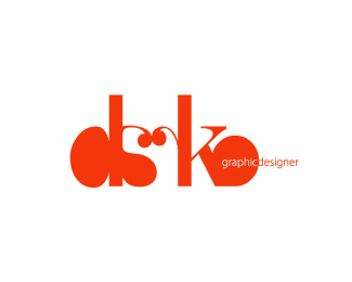
A logo design for me personally. what do you think?
Status:
Nothing set
Viewed:
2312
Share:




Lets Discuss
Hi,**I really like the look of this with the one colour. However, I could not tell that it said %22Darko%22. Also, maybe the %22graphic%22 from %22graphic designer%22 would be flooded with ink if it was printed on anything apart from a high printing press. **Just a thought, thanks
ReplyI agree with the above. Love the look, just wish it were more legible and maybe had a new treatment/location for 'graphic designer'.
ReplyI also agree. The a looks too much like an s when reversed, and the r doesn't look like anything when reversed.
Replyillegible (is that how you spell it) I kinda get where the d, the a, the k and the o are.....not sure what happned to the r! and should there not be a space between 'graphic' and 'designer'? sorry.
ReplyPlease login/signup to make a comment, registration is easy