Newcastle Food & Wine
by JustCreativeDesign • Uploaded: Jun. 07 '09

Float
(Floaters:
12 )
Description:
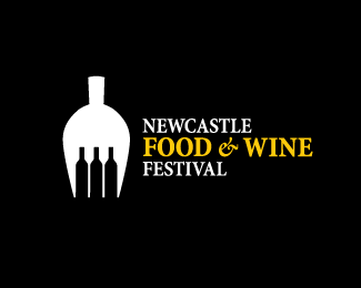
Newcastle Food & Wine Festival. The fork is made up of wine bottles in the negative space & the fork itself, when upside down, is also in the shape of a wine glass. The tilt of the top of the bottle is there because of the Nobby's Beach hill landmark which is very well known in the Newcastle area. See pic: http://i.pbase.com/g6/15/746415/2/77534378.DP3waZOu.jpg
As seen on:
Just Creative Design
Status:
Just for fun
Viewed:
14776
Share:

Lets Discuss
I would like to see more color into the design the fork and the bottles combination is poorly drawn....and the angle on the handle of the fork makes it inproportionate.
ReplyThank you HardD99.**Wiglaf,*I would have to disagree. The angle on the fork compliments the curves of the fork and in fact makes it look more like a fork than if it were straight. I would like to see how else you would draw a wine bottle - it is in its purest form here.
Replyvery nice concept, I really like it
ReplyThe bottles look very good , but the fork is not looking anything like a fork.*It is looking more like a scooper.
Replynice work! (I saw fork on first second...)
ReplyHi Jacob, big fan of your work and blog - true to form this is a fine example of how conceptualized logos can be. It instantly reminded me of the gfw.co.uk/ logo which has been much-bandied around the net for a while now.**That's not to take anything away from this logo which is great and superbly executed, I for one really like the melange of images to represent the interests of a company/organisation in such a simple yet clever way, but it sure isn't an easy task to achieve!**Good stuff.*@_markadams
ReplyThank you Mishka.**MrSparky, I am also a fan of the GFW logo, although the website needs a lot of work. Thanks again.
Replyit's a clever idea but i sort of agree with wiglafwinter on the execution of the bottles. I'm not sure if slightly wider spacing might help it (or narrower bottles) but the tines of the fork look a little too sharp...conjures up association with needles which i don't think is the feeling you're after. Being that thin also makes them visually weak compared to the weight of the rest of the icon...i do notice the repetition of weights with those lines and the weight of the word %22NEWCASTLE%22 and that is well done...but it still looks uncomfortably needle like or pitchfork like. It can be very difficult to make something that works in the mind as a concept succeed visually on paper. it IS a good concept.
ReplyThanks Rod for your feedback and email (check your email too).
ReplyPS. Will be tweaking the fork and bottle shape on next rainy day.
ReplyPlease login/signup to make a comment, registration is easy