Admix Designs
by JoePrince • Uploaded: Aug. 05 '10

Float
(Floaters:
47 )
Description:
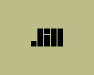
My personal brand, Admix Designs.
Status:
Client work
Viewed:
7290
Share:


Lets Discuss
They do flow better now. I like it, J.
ReplyNice improvement Joe - looks good.
Replylooks good man
ReplyThanks a lot for the support fellas, really appreciate it.
Replylook great together, Joe. nice change.
Replylookin good joe.
ReplyNice Joe, I like it!
ReplyThank you all. I am very pleased with how the entire identity has turned out.
Replyi love the custom type! nice work joe
ReplyNice type Joe, I like it! :)
ReplyThe type took a long time to develop and I couldn't be happier with how it turned out. The positive feedback is very appreciated, cheers.
ReplyI might add that the type is from a complete set I am currently working on, so when I say it took a long time to develop I mean the entire set.
Replyit flows better, thumbs up
ReplyLooks nice.. I think it needs a touch more space between the icon and admix, at the moment it looks as though the space between the icon and the name is tighter than the word spacing.
ReplyClean and simple. I really the layout and the combo mark/type.
ReplyLooks really good, JP. but i love the previous one too. :)
ReplyTypical designer, we are never satisfied with our own identity, looks great Joe... really!
ReplyReally means a lot coming from all of you, many thanks.*@s7even, I'll take a look at the spacing. I appreciate the input.
Replypush harder
ReplyI know the feeling Joe. FWIW I think the M looks a tad to narrow.
ReplyM is usually the widest letter in the Alphabet. That's how how %22em squared%22 came about.
ReplyI wasn't aware of that Mike, always appreciate your insightful advice. I'll take a look at that M.
Reply:) free of charge.
ReplyUPDATED**Thanks for all the helping hands.
ReplyI always loved your mark Joe!! Gret job!!
ReplyI'm about to raise an issue that may get under your skin. Know I say this with the best of intentions. **Ever wonder why you don't see a construction firm named %22___ Constructions%22...? It's because it's selling a service%3B the assumption that the name would read accurately as %22___ Construction (Services)%22 if you really consciously put what they do at the end of their name.**The only people who pluralize Design are those people who sell tangible objects that have been designed. Actual 3D things. Like...furniture, dolls, crafts, things. The designs themselves, not the services to design more intangible things like logos (non-3D things). **Ever look at the top design firms? None of them are called %22___ Designs%22 for that reason. **In fact, I've inadvertently illustrated my point here -- I've just referred to them as 'design firms' ....not 'designs firms'. Get where I'm going with this?**Doubling back once again to the point I raised with 'construction'...put the word 'services' at the end of any designer's design firm, and it'll make perfect sense. If I were to do that here, with the name you currently have you'd have........'Admix Designs Services.'**At a time when you're re-branding your logo, I'd suggest considering re-branding your actual brand. I suggest you seriously consider re-naming your brand to be 'Admix Design'. So you will better fit with the industry you represent, with all due respect. Thanks in advance for listening to my points with an open mind.
Reply%5E I've always been curious as to how you differentiate the two industries. Thanks!
ReplyWelcome, theartistt!
ReplyI appreciate you taking the time to give some insight, JF. The main reason why I chose Admix Designs is because of the way it sounds versus Admix Design. I felt it had stronger presence and carried itself better. Also, the domain admixdesign.com was already taken. If I was going to use the name 'Admix' I had no choice but to put 'Designs' after it.**I hope that makes sense. Thanks.
Replywell, I guess just don't be surprised if someone calls wanting some chairs designed. :P
Reply%5EHaha Trish! Maybe you and I can work out a partnership and make chairs when we're not doing logos :)
Replyhow long will it take designers to realize they don't make brands?...people do**and Joe, I think you can do WAY better, naming and logo
ReplyThanks a lot for the information David. I agree with you about the possessiveness of a brand name. And I think for many designers, myself included, the right domain name is very important. Very frequently will specific domain names be taken and there really is nothing that can be done about it.
ReplyNice type and mark, mate :)
ReplyThank you, Davi.
ReplyThank you for the suggestion Anthony.
Replyamazing :)
ReplyThank you Konrad!
ReplySolid stuff buddy! %3B)
ReplyThanks MS, where you been bud?
ReplyThanks a lot Alena! I am very pleased with how everything has turned out :)
ReplyI love the fresh retro look of this. Feels like a classic but still really hip. Great job.
Replya very nice update joe
ReplyLuma and Florin...thank you for the nice comments :)
Replyyeah I really do like the style of this one, and the colour is spot on!
ReplyCheers Eric! Thank you :)
ReplySomebody ripped my personal logo :/ Thanks to Andrej (hyperborea) for the heads up. Here's the link: http://www.elance.com/samples/png/24123263/%23posSlide
ReplyHi Joe check out the portfolio of this guys, I think they rip off some more logos include mine... http://www.elance.com/s/onefourfive/
Reply%5EThanks Alex, just posted the link above also. Such a shame :/ I talked to Elance support and they are investigating the matter. If I hear anything back from them I'll let you know.
Replywell, havn't seen your link... but better safe than sorry...
ReplyAbsolutely, appreciate it bud. Hopefully the designs are removed...keep me posted please.
ReplyYeah and he's using Humanot's mark as his own. he just rotated it. http://logopond.com/gallery/detail/13364
Reply%5EThanks Mike. I knew it looked familiar. There are a couple others in the portfolio that I know are rip-offs but can't find them on LogoPond to alert the designer.
ReplyMaybe someone should start a thread post with the link...
ReplyVery nice mark overall. I agree it flows quite well.
ReplyThank you alexander.
ReplyThis is eye catching, I like this Joe!
ReplyCongrats Joe!
Replynice, clever
ReplyReminds me of a curling stone!
ReplyPlease login/signup to make a comment, registration is easy