Description:
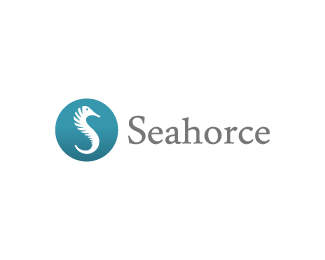
Final version chosen by client.
Copyright © 2010 Joe Prince and Admix Designs.
As seen on:
Seahorce Solutions
Status:
Client work
Viewed:
15749
Share:


Lets Discuss
cool looking solution, Joe.
ReplyThe sea horse S is great, though I would look to curve the spine more. the roundel though IMO is diluting the seahorse mark, I would loose it. Use the gradient in the Seahorse?
ReplyI wonder if you could make the curl go like an actual Seahorse? it curls to front.
Reply@Mikey, thanks bud.*@Pual, I'll have to take a look at that and see. Thanks for the feedback.*@Mike, conventional sea horses do curl to the front but the client requested it be in the shape of an 'S'.
ReplyThis is looking great bro, but it reminds me of something, can't figure out what though. Sharp design anyway.
ReplyI really love the simplicity Joe. Funny, I just put this on a tweet, Da Vinci said 500 years ago: Simplicity is the ultimate sophistication.
Reply@Stelian, thank you for the kind words...I appreciate it.%0D*@Rudy, that Da Vinci was one intellectual fella! Cheers bud :)
ReplyClient loved the mark by the way. Thanks for the support everyone.
ReplyI loved too!!
ReplyYou're too kind Alan! :)
Reply...seeing pixelflow's comment reminded me of this http://logopond.com/gallery/detail/81190
ReplyThank you for the link Capota. I spoke with Milosz and got the okay from him to continue with the mark.
Reply*Updated with type. I appreciate the positive feedback :)
Replyjoe...the type is to close to the mark maybe shifting it 2 point down will reduce the crowd. Also how about the type in all caps?...H is poking the mark. S of the mark and the type are to powerful and stealing the show...IMO
ReplyThanks nitish. I had a version with all caps that I presented to the client and they chose to go down this route. I do agree with you that it would give better balance with uppercase...I might upload that version just for here. This was the final version chosen by client :) Cheers bud.
ReplyEither way it's a very nice typeface. I also like the sea-blue colouring. What does the company do Joe?
ReplyThanks Colm! :) They provide consultant services and are in partnership with salesforce.com
ReplyJoe, it works for me, can't wait to see the applications, let us know.
ReplyThanks for the enthusiasm Rudy...I will definitely keep you posted. I'm eager myself, cheers! :)
ReplyGreat mark! I assume the word is misspelled intentionally? Seahorse is not spelled with a 'c' %3B)
Replynice solution there. great work.
Replysorry, just feel that it look like worm.
ReplyBeautiful. Nice solution JoePrince
Replynice n simple
Replythe marks have different executions, just that they represent the same thing, i think you are okay :)
ReplyNice Joe, I feel like the mark should be rotated slightly, seems to be leaning towards the left
ReplyThanks everyone :)
ReplyThanks Justin :)
Replystrong execution, good work!
ReplyAgain a very clean and nice design, very well done!
ReplyThanks BK and Webdesign!
ReplyA temporary website design has been launched, click %22Seahorce%22:http://seahorce.com/ %3C----
ReplyHey Joe, how do you put the links here?**Nice Job BTW, I mentioned before :)
Reply%5E just beneath the text box where you type the comments it says: Comments %5BNow made fashionable with Textile%5D**check out the Textile for text formatting
ReplyMerci Stelian.
Reply%5E%5EThanks Rudy! And thanks Stelian for the lesson :)
ReplyGracias senor Lane.
ReplyGood mark, buddy :)
ReplyThanks a lot davishama! Client was very satisfied.
ReplyPlease login/signup to make a comment, registration is easy