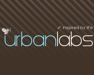
Float
(Floaters:
1 )
Description:
Logo design for one of my upcoming sites.
Status:
Nothing set
Viewed:
3247
Share:


Lets Discuss
super duper trendy. interesting font.*// are you set on the slogan?
Reply@jhtaler - No the %22inspired by life%22 will more than likely be changed, any ideas? :)
Replygreat shapes in your butterfly.. could you use an antenna in the place of // .*I have mixed feelings about the //.** i'd need to know more about your offerings for more help on the slogan.**maybe lower the opacity on the diagnol lines or replace them with shapes (curved patterns) more relevant to the curves of your butterfly and font. Maybe a large butterfly watermark for presentation??*
ReplyThe colours, butterfly and font are nice. But the background and %22//%22 beside the slogan i'm not feeling. *
ReplyPlease login/signup to make a comment, registration is easy