Description:
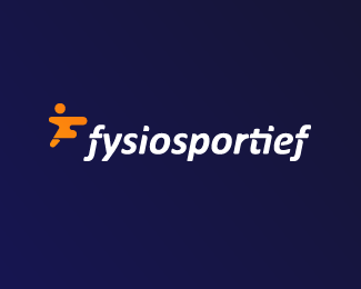
Logo design for a Dutch sport physiotherapy company called 'fysiosportief'. They asked me to come up with a new refreshing logo for their business. The client preferred the type to be custom and as friendly looking, easy to read and a little twist integrated in it that shows some sort of speed and dynamic.
The icon is a combination with the letter 'F' together with a running human. Also tried to perfect the balance by adding that same shadow effect from the typo.
As seen on:
www.dribbble.com
Status:
Unused proposal
Viewed:
11068
Tags:
fit
•
active
•
sports
•
physical
Share:



Lets Discuss
More details here:
Replyhttp://dribbble.com/shots/1440409-Fysiosportief-Branding?list=show
Looks great, Jeroen. The mark and type go very well together.
Replynice
ReplyPlease login/signup to make a comment, registration is easy