Description:
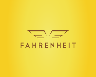
my proposal is to highlight the brand as a brand, based on surveys of famous designer brands, I found that they employ more emphasis typography and some consist a graphic symbol.
For construction of the logo was not the focus Fahrenheit stuck to the sense of the word (temperature) to which it refers, but identify it as a brand aimed at the male audience.
Graphic symbol consists of 2 fs which form a pair of wings that symbolize freedom and balance confidence, if we pause to note that some brands their logos are formed by the wings that we see in his audience is mostly male example, Honda, Harley Davidson, Chrysler, Ducati etc..
Typography was highlighted by way of having good reading and application in products such as graphic symbol without much detail.
Status:
Nothing set
Viewed:
937
Share:


Lets Discuss
Please login/signup to make a comment, registration is easy