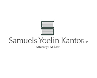
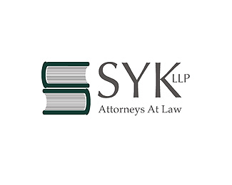
Samuels Yoelin
by JeffFisherLogoMotives • Uploaded: Jan. 07 '07

Float
(Floaters:
5 )
Description:
Graphic representations of two heavy law books formed an S letterform and became the perfect icon for a law firm. The identity was honored with a Bronze in the Summit Creative Awards. It has also appeared in the 1997 PRINT Regional Design Annual and the books International Logos & Trademarks IV, New Logo & Trademark Design (Japan), The Big Book of Logos, Global Corporate Identity and The Best of Letterhead and Logo Design.
As seen on:
bLog-oMotives
Status:
Nothing set
Viewed:
5462
Share:


Lets Discuss
brilliant!!!
ReplyThanks nido!
Replyone of the best i know
ReplyPlease login/signup to make a comment, registration is easy