Portland Pride
by JeffFisherLogoMotives • Uploaded: Jun. 09 '07 - Gallerized: Dec. '07

Float
(Floaters:
25 )
Description:
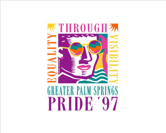
With permission of the Palm Springs Gay Pride organizing committee the image, with slight alterations, also visited Portland for Pride events in the same year. The image appears in New Logo & Trademark Design (Japan), Logo & Trademark Collection (Japan) and The New Big Book of Logos.
As seen on:
Jeff Fisher LogoMotives
Status:
Client work
Viewed:
5694
Share:

Lets Discuss
Climax about summed it up.
ReplyWow. Great statement Climax. Jeff, you should be honored that your work has this sort of impact on the design community. I have seen your work since I started in this field...and I agree with Climax.**Great work...always.
ReplyClimax (and OcularInk and ahab) - Thanks so much for your comments. **It is always interesting when some individuals seeing/reviewing particular examples of my design work can't get past the content, or entity being identified, to evaluate the images on basic design merit. As an artist and designer I guess I always expect much more of those in the profession. When I am critiquing designs, or judging work in a design competition, I do my best to keep my judgments limited to the design itself rather than letting personal beliefs, biases and feelings get in the way. I do tend to learn a great deal about others - and myself - in that process. **Various designs of mine - for nontraditional businesses, organizations or causes - have resulted in %22interesting%22 comments, or initiated a social debate, on a number of online venues over the years. In some cases I guess that is a sign of the strength of the image - there is some measure of success in a logo attracting enough attention to create a strong action or reaction. However, that is not necessarily my intention in executing such designs. I'm simply doing my best, using my talents and skills, to meet the needs and desires of the client.**I always appreciate the constructive criticisms of my work - and certainly welcome any kind and supportive words. Thanks!
ReplyIt is a nice logo Jeff. It looks like a stamp.
Replyten years later it gets posted?
ReplyAt the risk of sounding like a killjoy, I find it too 'busy'. And I can't help thinking that it looks very dated - like late 1980's design: it's not a timeless design. Sorry.
Replyi dont believe there is such a thing as 'timeless'... but rather 'taste'... Mozart may be considered 'timeless' but is not to everyones 'taste'... similarly someone like Boy George is not to my 'taste' but is by some considered to have a few 'timeless' works... in the end all things move in cycles... they have their moment.. they go.. they return.. so forth...%0D*%0D*In regards to this logo... as a 'work'... i find it very appropriate... it has a 'carnival' feel to it... ive always seen carnivals as a way of expressing your (collective) pride in something... %26 yes.. it has that 80s feel to it... but that is almost a homage to an era that a lot of %22homosexuals%22 stepped forward %26 were no longer afraid of being who %26 what they were!%0D*%0D*In regards to what this logo represents... I have my personal views... but does that matter???... i always wondered if the Nike logo was ever uploaded on the pond... how everyone would applaud it... wonder how many would comment on how they disliked it cause of allegations made in regards to slave labour???%0D*%0D*Finally my views on Jeff as a designer %26 his designs.... simply doing his best, using his talents and skills, to meet the needs and desires of the client. %0D*
ReplyI just think that there was a lot of work like this in the late 80s %26 early 90s. It's well done, but I've seen loads of other stuff like it. Anybody who doesn't like the logo simply because it's for a gay pride event should keep their opinions to themselves.
ReplyMost of us on logopond can only dream to have a career in design as long and as celebrated as Jeff's, and a portfolio that spans 3 decades. In regards to this particular logo, it may be dated in 2007 but 10 years ago it perfectly answered a brief, I think that 'nido' is spot on with his comments about this 80's design feel being used in a 90's logo as an homage to that era of change. I will also add that there are no age restrictions about what logos we can or cannot upload, I'm happy to look at a logo that was designed 50 years ago as much as one designed 50 minutes ago. I say thanks for showing us snippets of your past portfolio. Jeff, you rule my friend!
ReplyAmen to that!
ReplyI have to agree...stylistically it was at it's strongest during 1997, which is all it ever needed to be.**All logo's, but especially 'Event Specific' logos date, because they are a solid representation of the time/history and/or cultural significance of the event.**Web 2.0 logos for example, will date... **Now with that said, what is this logo? It is for a gay pride event, so therefore it's not going to be subtle, it is going to be vivid, flamboyant %26 it will have a kitsch*charm about it...**Which this logo has %26 does very, very well...
Replymy work go through many 'flawed' stages... now i know when to stop %3B)
ReplyDavid, I didn't say it was a 'bad' logo - I said it was well done, but doesn't age very well and looks like a lot of design work from the same time period. I suppose I was really wondering why it had been singled out. 'Too busy' isn't a buzzword - it's a quicker way to type 'There is a lot of detail %26 colour, lots of compositional elements. Too much for my taste.' It's a personal reaction in the same way that some people don't like minimalist logos because they are 'too empty'...
Reply@drewboy%3B %22looks like a lot of design work from the same time period%22**So therefore it is an accurate summation of the design work of its era...
Replyhaha... drewboys the punchbag... lol
ReplyPoor drewboy! ha ha ha
ReplyI 2nd that...
Replycan i just say that in general... society IS regressing as a whole.. everywhere you look... in all walks of life.. have you noticed since computers got smarter.. we actually got stupiderer... maybe something else that could be said about this logo.. in an era when 'simpler/simplistic' may have been better... people like jeff were going all for it!... now we could do 'too buzy' in the press of a few buttons... yet with all thats available to us... we are still lost...
Reply%22have you noticed since computers got smarter.. we actually got stupider%22**Interesting point :)
ReplyHey, we're all starting to sound like my parents now... I've just drunk half a bottle of champagne %26 I'm completely impervious to all criticism!!!
ReplyThis is a subjective industry though - you can admit that something is technically or objectively good, but if your gut reaction is still 'no' then you have to go with that as well! I'm not talking about trendy logos or trying to embody the spirit of the age (or decade, or year or month given that trends seem to come %26 go pretty quickly these days...)
ReplyWow - I just popped in and found this whole thing had evolved into a really interesting discussion and it's something I really appreciate.**nido said/wrote: %22have you noticed since computers got smarter.. we actually got stupiderer...%22**I don't know if %22stupider%22 is necessarily true. I do think a lot of designers have gotten lazier with the computer as a tool. I was designing logos for about 15 years before a computer appeared on my desk in 1990. For me pre-computer logo design was a much greater challenge. After coming up with the visual concept it was a often the greater challenge to figure out how to actually execute the design with the physical tool limitations of the time. At times the availability of a computer makes the execution process a bit too easy. Still, I'm not using the computer to actually design logos - just as a tool to translate the ideas that come to my mind.**One of the things I most often strive for in logo design is an end result that does not look as if it was created using a computer and the usual software programs.**
ReplyDavid - I'm a parent as well %26 I second your %26 Nido's comments - it's true that you see things differently when you have kids...*Hi Jeff - sorry for using your logo as a starting point for my rant!!! What you just said is very true - the easier it is to produce things, the worse they seem to be. The number of badly-designed 'things' - not just logos, but shop signage, magazines, adverts - that we see is directly linked to the fact that with a computer, Photoshop %26 Illustrator, people who don't necessarily have the skill or the 'eye' to design can do so very easily. When I see old shop signs I am astounded at the typography, amazed at the technical skill required to letter something like that with a brush...
ReplyTo Drewboy, in regards to my previous comments, I wasn't singling you out (or rather, that wasn't my intention) I just wanted to explain to people that this logo's concept isn't supposed to be a sign of the 'current' times, rather a 'snapshot' of Jeff's career...%26 I too agree with his last statement, computer based design has become too mainstream.***...on certain 'modern' logo's I've seen, you have to wonder about who should get the credit, the designer or Adobe?
ReplyIt is not the tool you use but how you use it.
Reply%5E%5E thats what people with small tools say ... lol
Replyexactly...
Reply*my comment was a in regards to Dache, Nido got in between
ReplyI agree about the use of technology nowadays, it speeds up the process but also takes away the hands on approach that most of us started out with. I remember back 14 years ago in art college, we didn't touch a computer only to print text onto acetate to add to a particular image etc. I also remember having to hand render a whole fictitious newspaper frontpage using one of those point size scales, days of work which felt pointless at the time, but I think if I found it amongst my old portfiolio today, I'd feel kinda proud of it. The computer only became a tool in the last year, and was limited then. We are blessed nowadays with the technology infront of us but we should never forget the importance of a sketch pad (Moleskine's are expensive but make you feel a bit like a modern day Van Gogh, without his talent ofcourse!), a pencil and your mind. My mind is usually the least reliable of the 3!
ReplyAnother thing about using computers is that the idea that 'we will have more free time in the future thanks to computers' is completely false%3B I used to work with a designer who was in her 50's (this was in the late 1990's) %26 she hated using a PC, because a rush job timescale had been reduced from a week or so in pre-computer days to the next day or same day. She had a point. I seem to work on emergency timescales all the time now%3B I very rarely get the chance to spend a couple of days considering %26 revising my work. Very often it's the first idea (not neccesarily the best!) that gets used, simply because 'the client' needs the logo, advert, brochure as soon as possible... I suspect that this is another reason why things are often badly designed nowadays. As Jeff said, it's not the computer that comes up with the idea, but I know I am often forced into thinking of 'how quickly can I get this done in Illustrator' rather than 'how good is the initial idea'.
ReplyThis is a great thread going on. TT, you about summed it up. To all new designers, don't forget your sketch pad. This is where good design starts. Many logo designers (designers for that matter) think you have to be this genius illustrator/artist to get your ideas down. Nonsense. Simply grab a pencil and start doodling. One would be amazed at the ideas that will come out of it.
ReplyA lot of sketches are actually more powerful, more direct than finished works%3B I'm thinking mainly about painting here 'cos that's where I started, but it's the same for design work as well.
ReplyTT, OcularInk and drewboy - Sketching does often tend to get lost in the %22get it done now%22 process these days. I have a real appreciation for the art/design schools that won't allow computer use early in their programs. It does seem to force students to think - and allows many to thrive in the creative process.**Few of my design ideas ever come to me while sitting at the computer. My best design ideas come to me while sleeping, driving, in the shower, while gardening, in a particularly boring meeting, or elsewhere. That often requires doodling and scribbling on old envelopes, Post-It notes, memo pads, meeting notes, etc. Luckily, it seems I've never thrown any of these sketches in the trash. In going over 30 years of design files I have found many original concepts and have been incorporating them into my %3Ca href%3Dhttp://www.tinyurl.com/3bwej7%3EExcavated Artifact%3C/a%3E entries on bLog-oMotives. **
ReplyGuys, Jeff's Excavated Artifact entries are worth a look. Great for inspiration!!**@Jeff: These last two years have been a huge awakening for me with my design process. Having a sketch book handy (or one of those tiny little cheap notepads) is a must have tool at all times. Inspiration hits you at the weirdest times. You never know when it'll strike, but when it does, you have to be ready to document it. If any of you don't already do this, try it out for a week. Your life will never be the same.**I also agree with your thoughts on art/design schools. I went to a small private college with an intimate design program. For the very first year, my classes consisted of drawing, painting, art history, typography, color theory, and design communications. I remember having to create flat acrylic paintings (15 x 15) to express a word with out using the word itself...only graphics. They took hours!! We must have done 20 of these. One of the grades given was based on your craft. I don't think we moved to the computer until second semester of my second year. This gave me a clearer picture of the actual design process and how effective it can be when followed.**Anyways, just rambling here.
Reply@Oc. In the words of the great Led Zepp..... Ramble on! When its good content there's no problem with a little rambling!
Replyi think it is more important for a logo for an event to be timeLY not timeLESS. Spot on Jeff.
Reply*Computers are useless. They can only give you answers.**Pablo Picasso
ReplyPlease login/signup to make a comment, registration is easy