Description:
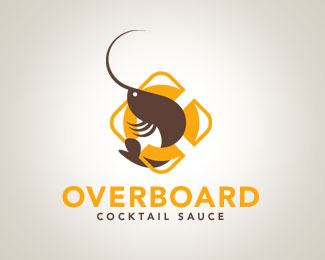
Overboard Cocktail Sauce is made in Charleston, South Carolina, using entirely local and fresh ingredients.
Status:
Nothing set
Viewed:
4723
Share:






Lets Discuss
Nice mark...I love the idea!
ReplyWould like to see some color exploration and the kerning is tighter on ERB than the rest of the text. But nice fun mark.
ReplyI agree with LoGoBoom about the kerning. The shrimp could benefit from a %22Cooked Shrimp%22 shade for a more appetizing effect IMO!
ReplyCute. There are kerning issues. But I wouldn't change the color. (Why save a dead shrimp? Sorry Kode.).
ReplyHey *Trish*,*About your comment _%22why save a dead shrimp?%22_, not sure this is about saving shrimps even though there is a lifesaver in the logo.**When someone says cocktail sauce I immediately think %22Deliciously Juicy Shrimp%22 but not live or raw!**It doesn't even have to be a %22cooked shrimp shade%22 in fact, any shade with a fresh feel would do, the brown is an earthy tone that doesn't fit the composition!**By the way, no need to be sorry! I think that when designers disagree on something, a healthy debate can provide for creative exploration!
ReplyYou are probably right. My favorite color is brown so I have a tendency to favor it. I can see where, for some, brown would not necessarily elicit good things in the taste department.
ReplyNice flow to the prawn/shrimp coming through the lifesaver. I think you may have gone a bit overboard with the frame around it.
Replyyeah, i'd prefer it with the prawn only%3B or atleast try a differently designed lifesaver. you live in charleston? I'm up in greenville, not too far from ya.
ReplyBut I can see the O in the lifesaver and the prawn makes a lowercase b. The style is consistent throughout. I'd leave the design well enough alone (except for maybe the color%3B you know where I stand on that, however).
ReplyI like it a lot. The colors are great. Something about the shrimp's tail is off putting though. Maybe that it comes out so close to the split in the yellow ring?
ReplyPlease login/signup to make a comment, registration is easy