Float
(Floaters:
28 )
Description:
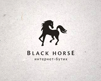
Logo for internet-boutique
Status:
Work in progress
Viewed:
11234
Share:


Lets Discuss
Don't take this the wrong way because I think you're an incredible designer and I love your work%3B but I think this one could be better. The thing that keeps bugging me is the chest area of the horse. I'm not a horse expert, but it doesn't seem muscular or bulky enough to me. It makes it feel a bit feminine to me.**Maybe this was the intention?
ReplyPlease login/signup to make a comment, registration is easy