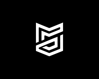
Description:
This is the part of my re-brand for the year 2012-2013+
Not fully sure if this is the final one for my coming years.
Status:
Client work Viewed:
3197
Tags:
g
•
jg
•
personal
•
rebrand Share:
Looks like you enjoy Guerilla Games' Killzone series, but don't quite understand the idea behind their logo. They make shooters and their logo resembles the stripes of a military Sergeant. Your version loses this thematic connection. (I'm assuming you don't work with firearms fora living)
That aside, you've ditched the color and thus made the link to the inspiration harder to make, and the intermingling of two letters makes the logo rather hard to read. I can figure out two places where a G might be hiding and one where a J might be, but they're not nicely integrated.

Lets Discuss
One of my favourites!
ReplyLooks like you enjoy Guerilla Games' Killzone series, but don't quite understand the idea behind their logo. They make shooters and their logo resembles the stripes of a military Sergeant. Your version loses this thematic connection. (I'm assuming you don't work with firearms fora living)
ReplyThat aside, you've ditched the color and thus made the link to the inspiration harder to make, and the intermingling of two letters makes the logo rather hard to read. I can figure out two places where a G might be hiding and one where a J might be, but they're not nicely integrated.
Please login/signup to make a comment, registration is easy