
Float
(Floaters:
21 )
Description:
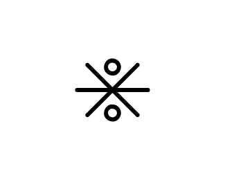
Personal logomark. Pseudo-ambigram.
Status:
Nothing set
Viewed:
4301
Share:

Lets Discuss
your mark is created by combining j 'n f, isnt' it ? it's cool
ReplyIt is indeed, rabbit_hoang. I appreciate the nice words -- thanks for your comment!
Replyvery nice! :)
ReplyThanks, KonradK! I appreciate both your nice comment and the float. **Thanks also to nima.jazireh for the float! :)
ReplyThanks, Matto, for the float! It's appreciated.
Replyit's got nice colors.. and super hero qualities.. kudos!
ReplyThanks for the comment, dannygdammit! Wow -- super hero qualities? That's %3Ci%3Ehighly%3C/i%3E flattering. Made my day. Thanks! And, also thanks for the float.**Thanks also to milash and mabu for the floats. I appreciate it.
ReplyMight you be gracing our eyes with some logos?
Reply%5EHaha, well...
Replyj-CAZ: perhaps. I'm working on two projects right now, and I'll probably post at least one of those when it's closer to done. It's nice to know someone would like to see my design skills at work. Thanks for the comment%3B I really appreciate that.**momentum magazine: I take it you like this one? Like to see my work? Well, whichever it is, thank you for the comment. I appreciate your float as well! **
ReplyThis is a great personal mark. I wish mine was half as good! In fact, even a quarter or third would suffice. :) *float*
ReplyWow, Chad Sanderson -- to hear that blows my mind. I'm....stunned! Thank you very, very much!
ReplyVery nice personal mark. Personally I would like it rather in black and white and with some little treatments but it is yours and its very strong idea.
ReplyThanks, janzabransky. Appreciated.
ReplyYeah....I upload them and then delete them. I usually upload WIPs, not final concepts, and I do it to hear the thoughts of members. Then after hearing any comments, I take the WIP logo down, and ultimately move on. If I ever post a final design, I may choose to leave it up%3B I'm mostly concerned about theft, a real issue here unfortunately.
Replyi'd really like to see this a bit more polished, JF! it has potential.
ReplyThanks, andreiu. It's just my avatar for here -- I'm extremely surprised it's gotten such a warm response as it is. If I ever choose to go forward with a new design identity...I'll likely be using this one. Thanks for your thoughts.
ReplyIt's actually a really nice mark! I almost want to see the red/orange pushed more towards orange. Because it might contrast better with the %22teal%22 color. I would like to see more work from you JF, as it becomes available or as you upload it because so far, I like what I see.
ReplyThanks, vision design and graphics. Appreciated!
ReplyCan you give it a little spacing within the boundaries...sort of like how other people do it here on the site.**What is the personality behind the mark? Are you going for playful, fun, etc...
ReplyHey there, Raja. This design is really just a shrunken-down version of my avatar. I put it up here so people could see it enlarged. It's really not a logo, nor does it have any specific purpose beyond displaying %22J%22 and %22F%22 in my avatar.
Replycool
ReplyThanks, joealexander. Appreciated!
ReplyWhat happened to your Olahi (did I get that right?) logos if I may ask? I thought they looked really cool.
ReplyHi mega. Was a privacy issue, will likely upload it again in the future. Thanks for the compliment.
Replyvery nice combination!
ReplyThanks, cpuentes23. Appreciated!
ReplyInteresting
ReplyThanks! Appreciated.
ReplyVery simple and effective. Good Job!
ReplyPlease login/signup to make a comment, registration is easy