Description:
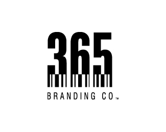
This logo is for a design company which does work in brand idenity/logo development and interactive/web design. The bar code represents the companies foundation for design which involves creative solutions based on brand principles.
Status:
Nothing set
Viewed:
2884
Share:
Lets Discuss
It's cool, but a really enjoy what your doing with the other one. If they don't like that one this would work just as well. Don't get me wrong this is good, simple and clear, I just think you are really pushing the envelope with the other one!
ReplySince this is my company I can choose whichever logo I want, but I'm going to explore many design options and get a lot of feedback before I choose the final design. What I like about this one is that %22365%22 is easy to identify and also the bar code concept is also clear. I think more people will understand this. However it may not be as memorable as the other concept.**Thanks for the input Gaard!
ReplyI really, really like this one. It's, as you mentioned, easy to identify. Not as 'edgy'....but to non-logophiles, this version will really communicate your brand. Well done!
ReplyThanks alldesign! I appreciate your input. I think your right on with your comments. The only thing I can't decide on is whether the other one will work better for its creativiity and uniqueness. I definitely want the audience to think of %22365%22 as a creative company thinking outside the box but I don't want them to forget the name either. I'm still a little on the fence between the two.
ReplyPlease login/signup to make a comment, registration is easy