Description:
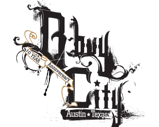
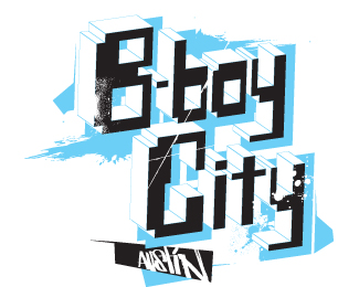
The logo is for an annual breakdance event held in Austin Texas and it is having its ten year anniversary. The idea for this is to introduce historic Texas type vernacular into an urban aesthetic. I created the type from blackletter influences and graffiti forms. If I had to address issues as I see it, it would be with legibility (though with this particular genre you can take more liberty with expression) and exceeding the treatment of the type? Any suggestions and advice is appreciated. Thanks. There is also another one I have uploaded as well. A different approach.
Status:
Nothing set
Viewed:
990
Share:

Lets Discuss
Please login/signup to make a comment, registration is easy