Description:
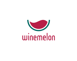
This logo is a real miracle. I hope you understand what I mean.
As seen on:
Brandstack
Status:
Unused proposal
Viewed:
14563
Share:


Lets Discuss
I like the feeling of this one. Nice job:)
Replyvery nice...
ReplyNice :)
Replyi get it... you turned water into wine!... watermelon... winemelon... boy I am good...**nice work btw billy...
Reply1/2 Pepsi :)**I would like to see if you transform that wine wave into %22W%22 wave shape.
Replynice mark, very clever!
Replyvery nice concpet and colors!
ReplyJust curious were you inspired by Jerron's logo posted on the same day? I just see similarity there.
ReplyIt's a long story, but no, I hadn't seen Jerron's logo before designing this one. Actually, I started working on a water theme (yup, a blue watermelon, with waves instead of pulp), but then Jesus and his miracle came to mind.
Reply(Because I needed some red liquid in order for the watermelon to look like a watermelon.)
Replywow... smart :D
ReplyI can't remember how the melon looks, but I get the feeling instantly from this logo
ReplyThanks for commenting, guys.
ReplyGood work. I get the concept.
Replycreative idea)
ReplyI really like this logo, however I have to ask: Does it look like the bottom half of the Pepsi logo? Either way I think it is very well done.
ReplyPlease login/signup to make a comment, registration is easy