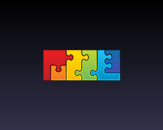
Float
(Floaters:
85 )
Description:
Warning: small pieces may present choking hazard to children under 3 years of age.
Status:
Client work
Viewed:
20893
Share:

Lets Discuss
Very nice idea! Maybe try to make black outlines thicker.
Replynice approach!
ReplyCan you read it without trouble?
ReplyKnowing what's there is a key to reading it. I'd say it's hard to pick up the word by just merely looking at it and without trying to find it there. Also the E is, of course, not exactly legible.**Undoubtedly it's a clever and unique idea. Well executed too.
ReplyIt takes a second or two to register, but is still a great idea - love the colour.
ReplyWell, its not instantly readable but the concept is fantastic. Nice work
ReplyThanks for all your comments and suggestions!
ReplyYou'r welcome!*That's much better now.
Replyamazing
Replyi wanted to test is at first place as I was guesing that there should be a word written. I read it without any trouble and it was a nice surprice to discover the meaning :)
ReplyI love the literalness of this logotype. Even though the E is backwards, I read the E much easier than I did the counterless P
ReplyNicely done William!
Replyperfect!!
ReplyThank you all!
ReplyNice ... wooow
ReplyVeeery nice!
ReplyGallerized!*Really nice.
ReplySo genious! Brilliant work!
Reply))) Really puzzle
ReplyVery nice!
ReplySomething really fresh
ReplyGreat!
ReplyPlease login/signup to make a comment, registration is easy