Description:
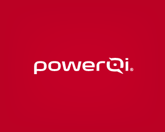
This is a custom type I have been working on this week, and I really need your suggestions/feedback. It has to do with cell phones. Is the 'Q' readable enough? What do you think about the logo overall?
Status:
Work in progress
Viewed:
2777
Share:


Lets Discuss
Reading it as Power Qi without a problem. The negative space in the Q suggests something screen related so it could work for smart phones as well. Red color is kind of boring though but probably given by the client, right?
ReplyHi Alen. Yes, initially they wanted a strong color but now have decided to go with green, as it conveys the idea of fully charged battery.
ReplyPlease login/signup to make a comment, registration is easy