GCC Skills
by Influxes • Uploaded: Dec. 03 '07

Float
(Floaters:
0 )
Description:
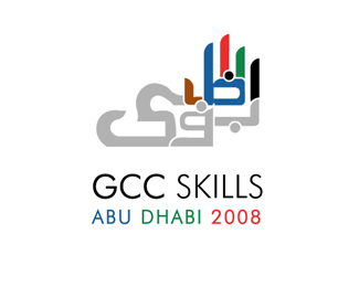
Proposed logo for GCC Skills.
GCC stands for Gulf Cooperation Countries and GCC Skills is an event they organise promoting vocational education in their countries or regions. The event is held in different cities every year and this year its in Abu Dhabi. The client wanted calligraphy and something that represented 5 or hands. Colours are client specified.
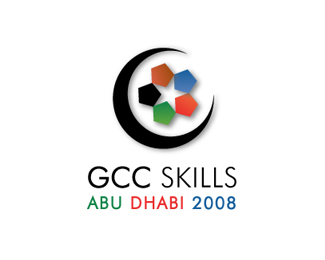
This second design is something simple.No calligraphy. Used polygons to represent 5 and a star to show that this is an competition and winner is a star.
I know both logo concepts are really different, but the client wasnt sure if he actually wanted what he asked me to design :) Hence this design.
I am REALLY looking for critiques. Help me out here.
Status:
Nothing set
Viewed:
1482
Share:


Lets Discuss
I prefer this mark - you could also argue that there is a reference to Islamic tiles in the form. The shadow isn't necessary %26 I would work on the typography. The mix of type in this version is not good - the two faces don't sit well together. I prefer the type you used in the first version.
ReplyThank for your comments, drewboy. I will make the changes and post the design again
ReplyBetter now, Drewboy?
ReplyThe type is much better now, Influxes. The only comments i would make are: maybe tighten the tracking on 'GCC Skills' to move the letters closer together%3B centre the text block horizontally with the mark (so that the top %26 bottom of the text are aligned with the right-hand points of the blue %26 red pentagons - at the moment the text looks a bit too high)%3B also, I think that you could leave out the colon between 'Dhabi' %26 '2008'. Apart from that it's looking really good - nice work!
ReplyThis looks fine to me!
ReplyPlease login/signup to make a comment, registration is easy